Top 3 Ways Your Web Page Needs to Comply with ADA Standards
- August 30, 2019
- / Ravin Floyd Nettles
- / Accessibility,learningcenter,Websites

DigiPro Media is the industry leader in web accessibility. So, as your expert it is our mission to empower you, to be confident when building your web pages on DigiPaaS.
Here are the top three things to check for on your site:
1. Images must have Alt text
Alternative text (alt-text or alt tags) provides a textual substitute to images in web pages. It is especially helpful for people who are blind and rely on a screen reader to have the content of the website read to them. The web has all types of images that have missing, incorrect, or poor alternative text. Like many things in web accessibility, determining appropriate alternative text is often a matter of personal interpretation.
Image elements must have an alt text describing each image.
Here are some examples:

Okay alt text: Rooster
Better alt text: Rooster crowing
Best alt-text: Red-crested rooster crowing

Okay alt text: man on escalator
Better alt text: man walking on escalator
Best alt-text: man wearing backpack walking down escalator
2. Links Need Descriptions
Every link should make sense if the link text is read by itself. Screen reader users may choose to read only the links on a web page. Certain phrases like "click here" and "more" must be avoided. Users should be able to quickly look at each link and tell where it goes and notify if the link is opening a new window.
Here are some examples:
Example 1:
Okay link text: "click here to access today's weather"
Better link text: "today's weather"
Example 2:
Bad link text: “read more”
Okay link text: "read more about global warming
Better link text: "about global warming"
3. Color Contrast
Contrast and color are other important components of accessibility. The contrast is a measure of the difference in the brightness between two colors. For instance, some users find it hard to read light gray text on a white background, dark gray text on a black background and white text on a red background.
Here is an example:
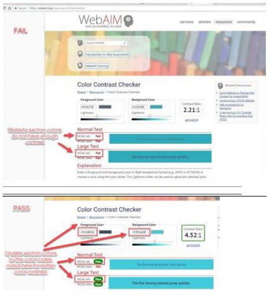
An easy way to check the contrast on your web pages is to use an online program, like webaim.
- Visit an online contrast checker
- Plug text colors into the foreground and background colors into background fields.
- If Normal Text passes for AA rating the color contrast is good.
- If Normal Text does not pass for AA rating the color contrast needs to be edited. Increase in contrast for both until it passes. Please try to keep the colors as close to original colors as possible. See screenshots above.
- The contrast ratio should be 3.0 or more for 18-point text, or larger
- The contrast ratio should be 3.0 or more for 14-point bold text, or larger
- The contrast ratio should be 4.5 or more for all other text
There are several factors which play into checking for web accessibility compliance. These are the top three factors that our accessibility experts check for first when determining if your pages comply with ADA web accessibility standards. For more tips or for clarification on these standards, please feel free to contact your DigiPro Media experts!
Recent Posts
-
 Federal Web Accessibility Lawsuits Nearly Triple In 2018
-
 Life, Liberty, and the Pursuit of Pizza
-
 Adot Labs is now CommonAccess
-
 How I See It: Business Websites vs. the Disabled
-
 Blind People Use Computers?
-
 Web Accessibility Doesn't Stop for Summer Break
-
 Are You Ready to Party this Cinco de Mayo?
-
 Designing with Visual Page Builder is Easy
-
 Strength in Numbers
-
 Small Businesses Celebrate Mother's Day